Projekt
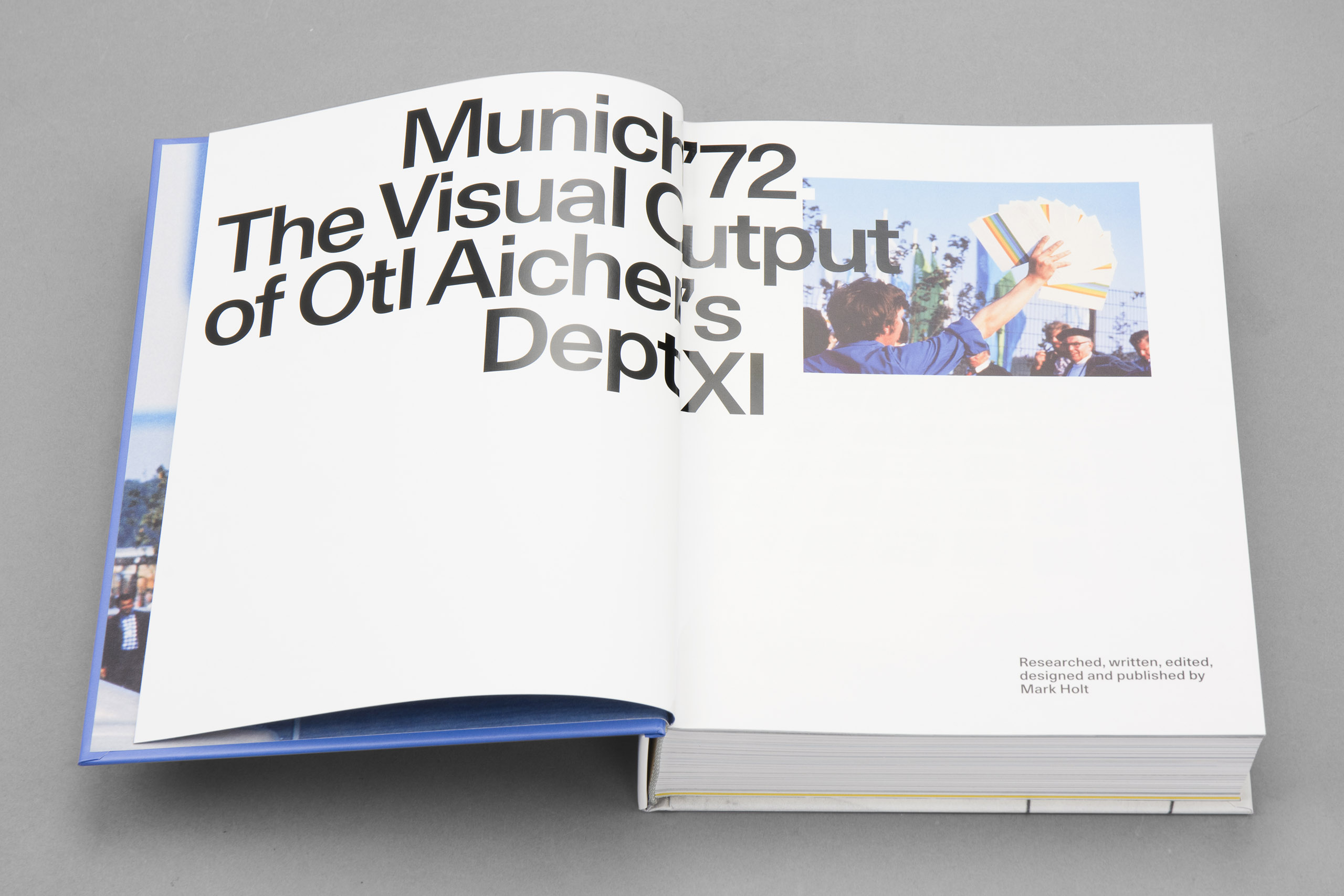
Munich ’72. The Visual Output of Otl Aicher’s Dept. XI
Kund
Mark Holt Design


Kund
Design
Trycksak
Teknik
Efterbehandling
Affärsområde
- Material, specifierat
- Pärmöverdrag: MultiArt Gloss 150g. Inlaga: MultiArt Silk 150g & Geltex 231-LS 115g. FoE: Munken Kristall Rough 120g.
- Mått
- 170 x 225 mm
- Övrigt
-
Tryckt pärmöverdrag med matt scratchfree-laminat. Debossed foliering av regnbåge på omslaget, folie: Kurz "light Line" Laser seamless folie.
Inlagan är tryckt CMYK + Pantone H-UV Metallic silver 877. En del av inlagan är tryckt på Geltex 231 LS som har exakt samma gula färg som den officiella gula OS-färgen från 1972.
Munich ’72. The Visual Output of Otl Aicher’s Dept. XI
“My first self-published book resulted from a desire to tell a story which until now has never been told. Almost 50 years after the 1972 Munich Olympic Games, very little was known about the team which supported Otl Aicher in the development of the visual image for what would become known as the ‘Rainbow Games’. So much so that Aicher has continued to be singularly credited for all the work, yet we know he did not, and could not, have done the work alone. That there had been no book to date, documenting one of, if not the, most important visual identity of the 20th Century was, to put it mildly, a great surprise to me.
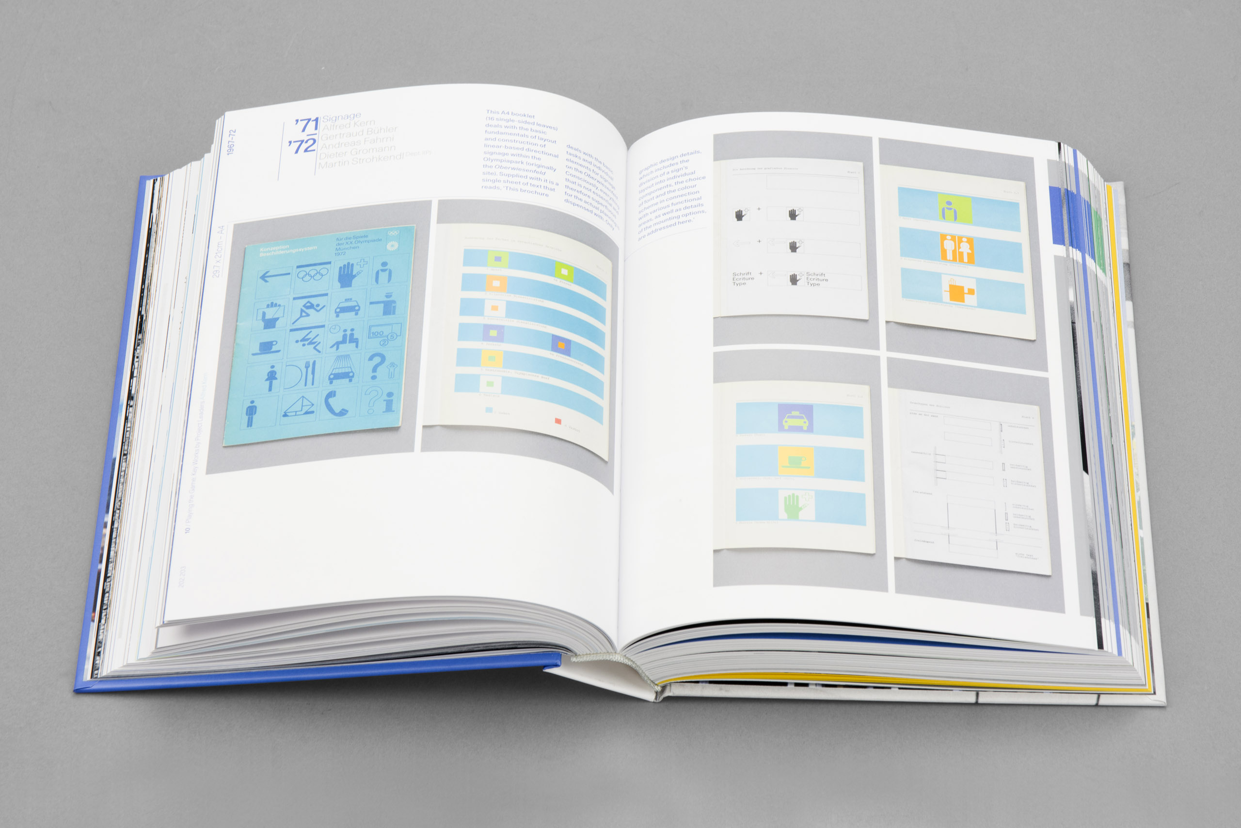
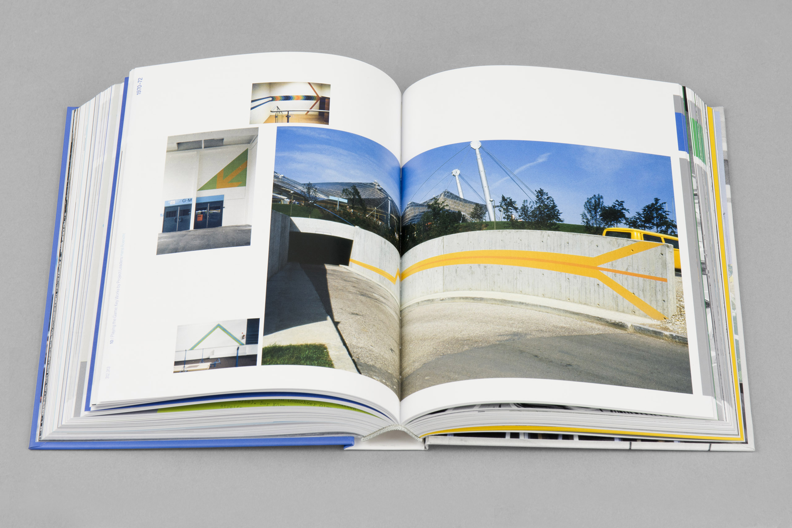
Aicher was appointed by the Munich Organising Committee as ‘Commissioner of Design’ and placed in charge of the Committee’s Dept. XI – the team responsible for visual design. From the decoration of the city of Munich, to posters, sports pictograms, bulletins, prospectuses, cultural event promotion, the Olympic mascot Waldi, the interiors of the Olympic Village, signage and apparel. Everything passed through his department. In all, some 82 known individuals supported Aicher; designers, technical draftsmen, artworkers, production specialists, studio manager and secretarial staff. They are the unsung heroes of the project and this new book set out to create a lasting testimony to them.
Otl Aicher was one of the founders of the Hochschule für Gestaltung (HfG) in Ulm, Germany, in the 1950s, one of the most important European design schools since the Bauhaus. The methodology employed by the school and the doctrines espoused by Aicher, and others at the HfG, drew Aicher to the attention of Munich’s Organising Committee President, Willi Daume. Daume’s vision for the Games was ‘the cheerful Games’ and Daume knew that Aicher’s experience, particularly that gained from his overseeing of the 1962 design of Lufthansa’s identity, meant he was uniquely placed to manage such a far reaching design project as that of an Olympic Games. The HfG philosophy was embedded into the Munich project from the onset, aided by Aicher’s hiring of a number of former HfG students. The project was as much about the framework and the systems programme, as it was about individual outputs. Visual consistency was key to the project’s success, achieved through a playful, non-dogmatic approach.
The challenges in producing the book were many. I knew the names of a couple of Aicher’s team and in fact had worked with one of them, Michael Burke back in the mid 1980s. I was determined to discover the names of as many individuals as I could and piece together a picture of Aicher’s project leaders, the team and their roles. Michael and fellow Munich colleague Jürgen Hoffmann, provided a starting point for my research, agreeing to be interviewed along with three others of the team. Sadly, a number of the key members of the team have passed away and so information was limited, and the memories of the few individuals that remain, not always the clearest. Invariably, recollections from one team member to another didn’t correlate. In all, I spoke with about 25 of the team and built up a detailed picture of the individual projects, Dept. XI structure and roles. Research was a key component of the book, firstly at the Ulm archive and followed by the Bundesarchive in Koblenz as well as at the IOC in Lausanne. This yielded a great deal of material, much unseen, including correspondence and such, but of course it was all in German. I took many photographs of what looked to be useful documents and was then faced with the momentous task of broadly translating them (some 30,000 words) using Google translate, so that I could understand their content and decide which were the most relevant. I then had many translated professionally for use in the book. Another challenge was photographing the original design work – posters and literature. Some of this had to be done in Germany at the archives, but much was loaned from collectors in the UK and photographed in London. Many of the historical images required hours of retouching. The project overall has taken four years, much of the earlier work funded by myself. To fund the printing, photography and translation and other key components, I launched a Kickstarter campaign, in 2019. Thankfully it was a successful one.
In approaching the design, I started with the narrative. The story is delivered in a linear, temporal way beginning with the story of Munich’s more famous Gold medal winners so as to contextualize the contents of the book for the audience. The chapters that follow introduce the project, the beginnings of the team, the competition for the design of the official emblem and the telling of Aicher’s strategy and his ‘Erscheinungsbild’ concept – that of his intended image of the Games. There is also a chapter on the team itself. My ambition was to name the 10 or so project leaders and elevate their roles and work and so they are given a section of the book. This is followed by a section of main works by the team in general. Here an attempt is made to credit the Dept. XI individuals against each individual work. Each of the works is also dated – although the Games took place in 1972, Aicher commenced his strategic thinking in late 1965 and the majority of the work was produced between 1970 and 1972.
When it came to the printing, my main concern was the need to try and match the vibrant colours utilised at the time of the Games using only CMYK and not special inks. I knew Komori presses would likely give me the best result and that Toyo inks would provide a much wider gamut of colour than everyday cmyk inks. I had previously produced a book working with Göteborgstryckeriet where the results, using these inks, were exceptional. Equally important was that the printer utilises HUV hybrid technology in their printing. This results in immediate drying of the printed sheet; importantly the sheets dry there and then, removing any risk of colours drying down and losing their vibrancy.
Being on press was a pleasure; Göteborgstryckeriet take great pride in producing high-quality books but for them it is equally important that the customer is happy throughout the process. Any issues that arise and they go out of their way to put things right. You feel like you are in safe and like-minded hands and that the final product will go beyond your expectations. In my case, it certainly did.”
– Mark Holt
You can order the book at markholtdesign.com
Relaterade projekt
Eddie Martinez – Drawings – More Drawings – Extra Drawings
TAI a Woven Culture
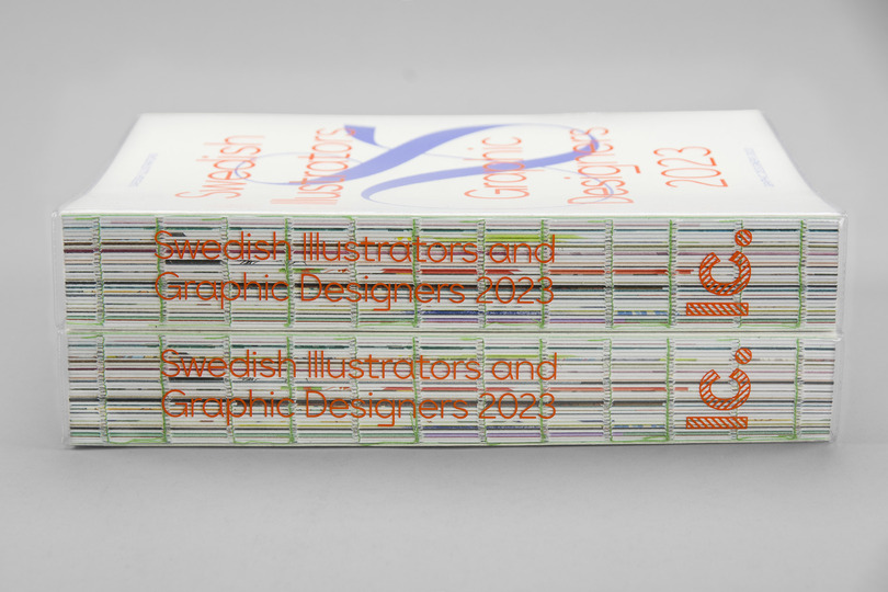
Årsbok – Swedish Illustrators & Graphic Designers 2023
Offecct + Pauline Deltour
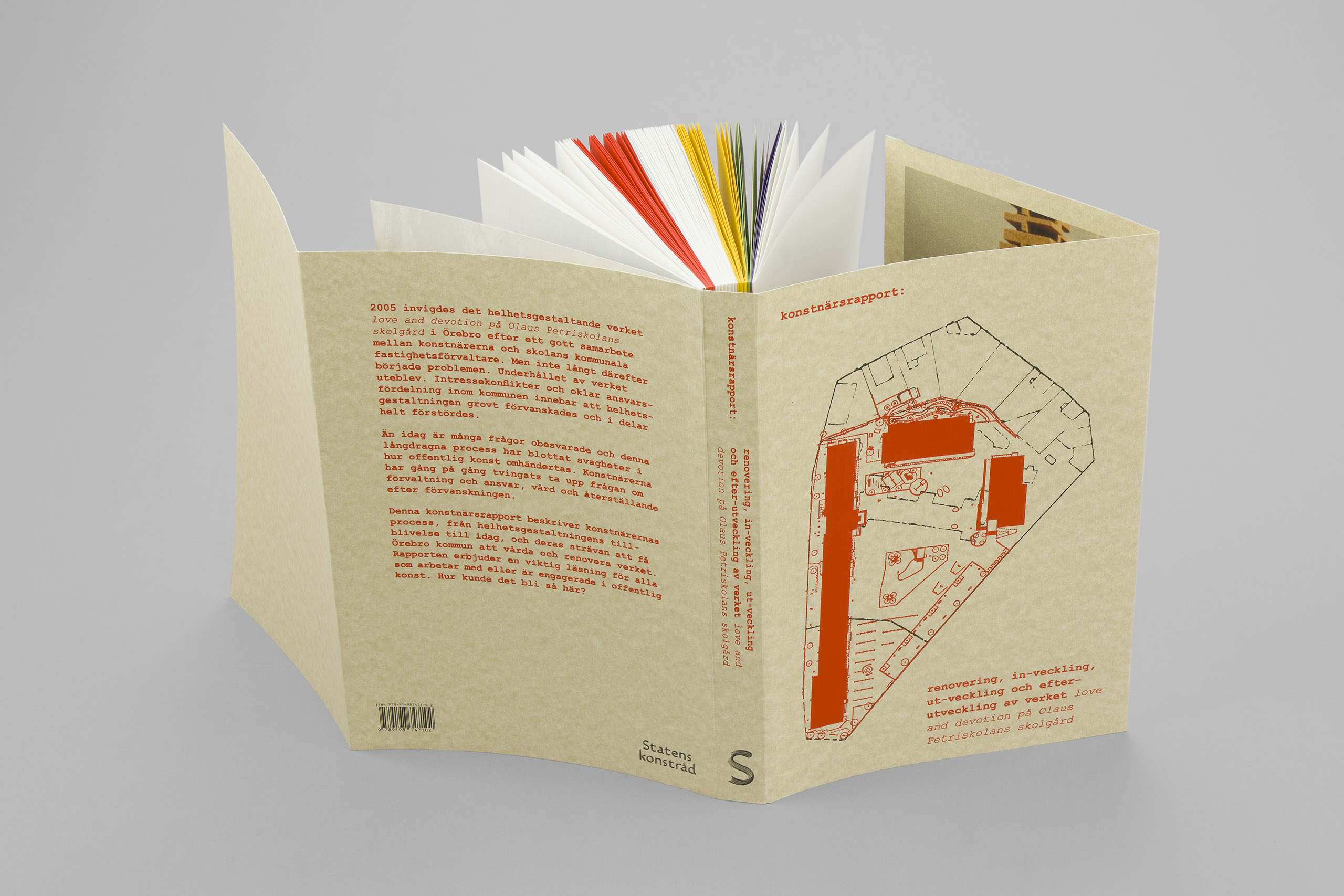
Konstnärsrapport – Statens Konstråd
Offecct + Lucy Kurrein
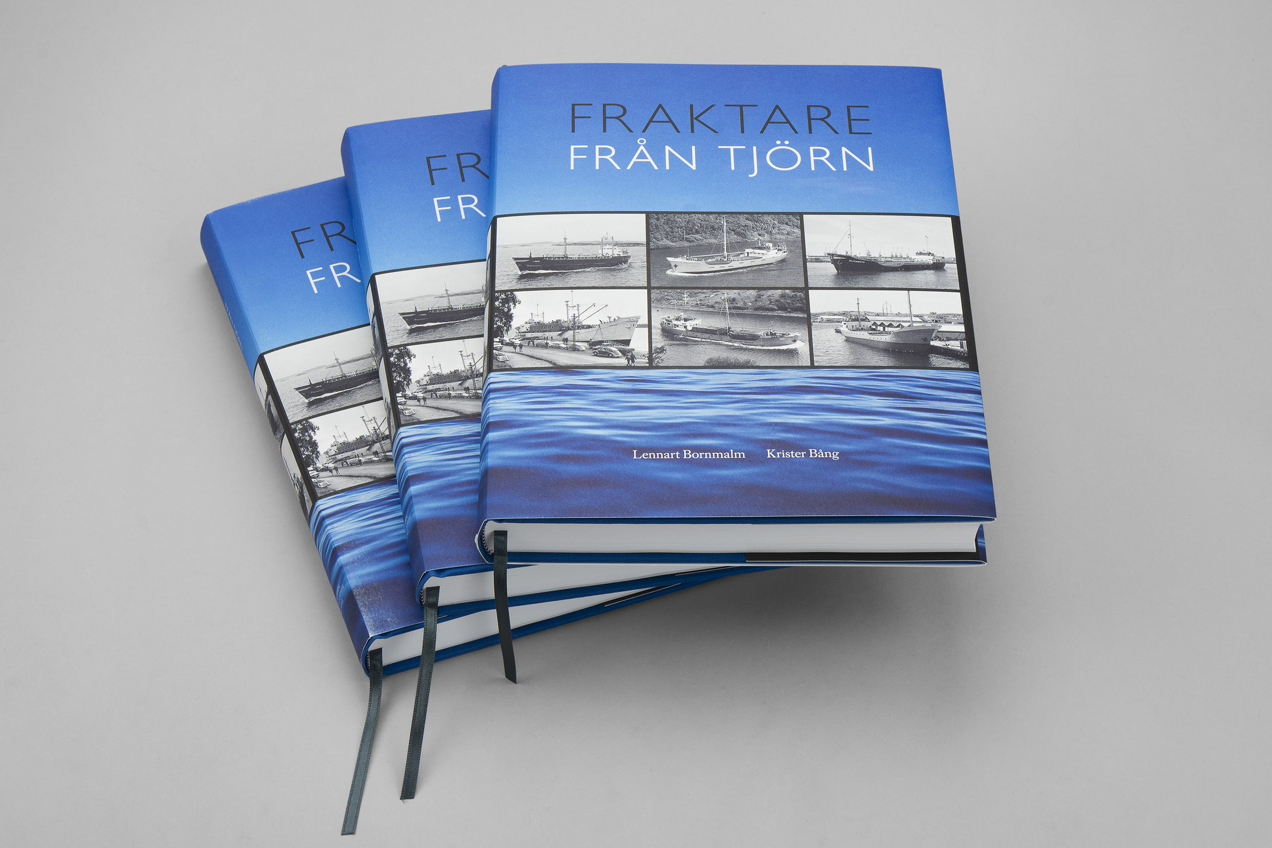
Fraktare från Tjörn
About the thin line in between – Emma Krantz
Sätt att se – En guide till Capri och livet
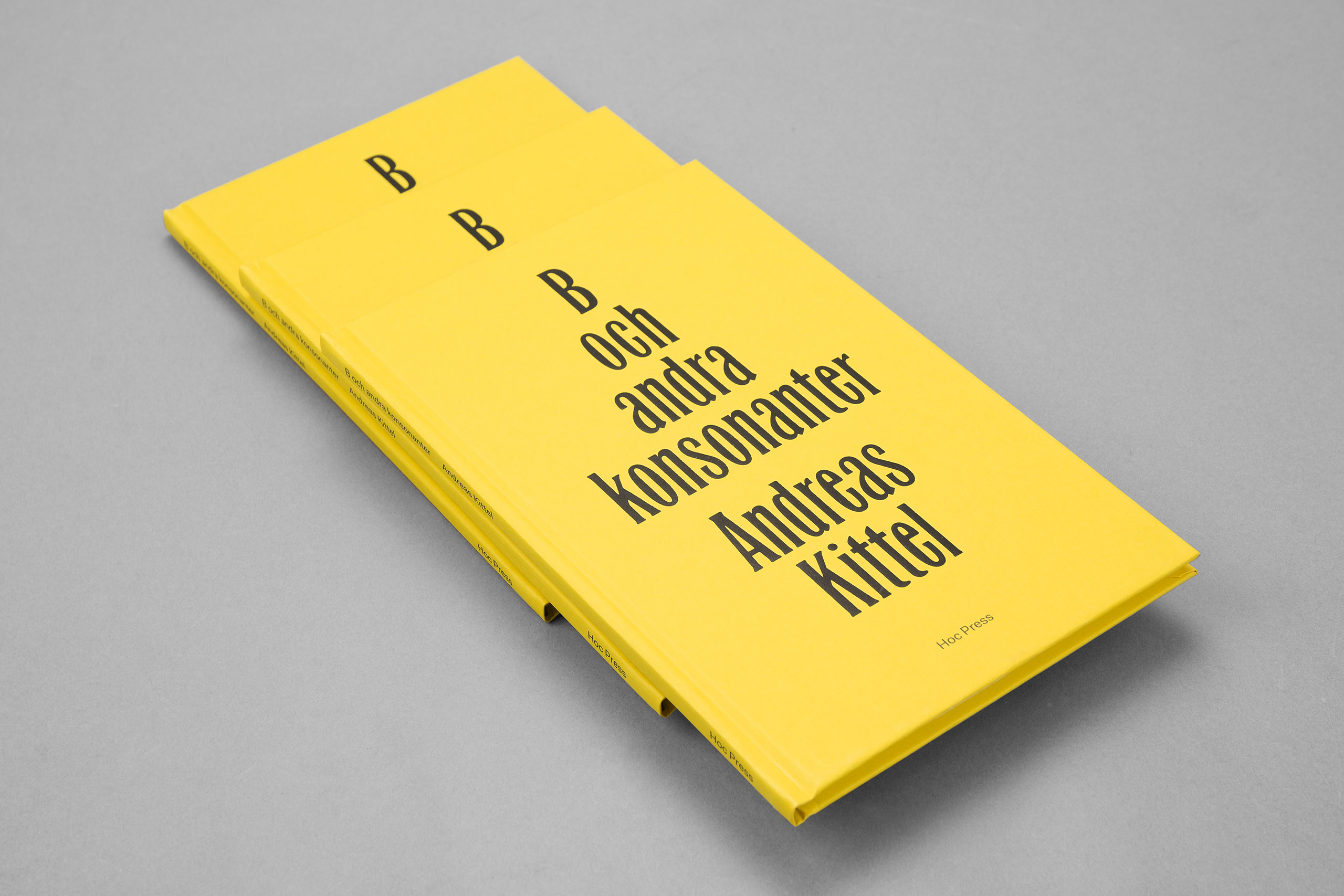
B och andra konsonanter
Pippiperspektiv
Imaginations x 12


Liknande effekter
Per Barclay – Soft Sweet Vortex
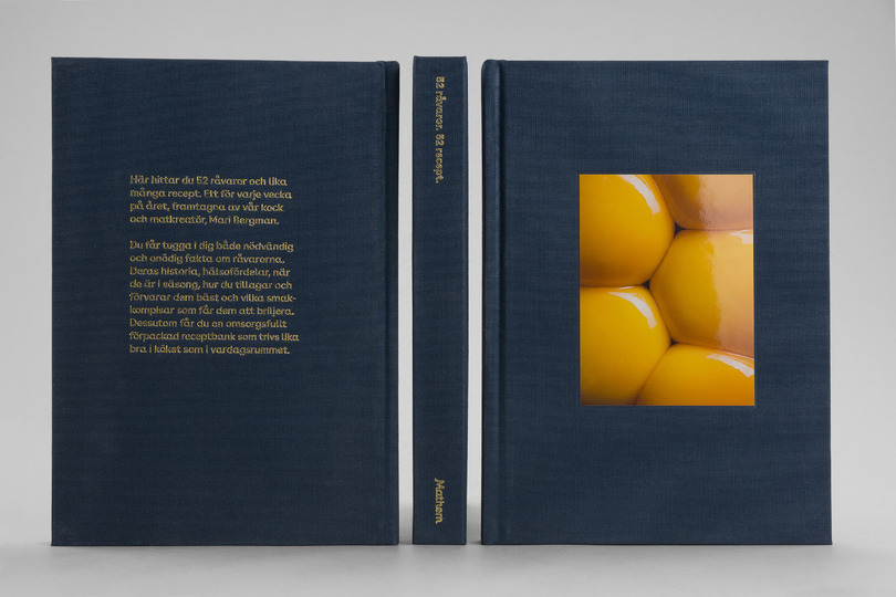
52 råvaror, 52 recept
The Next Day
Kokkaffe Landscapes
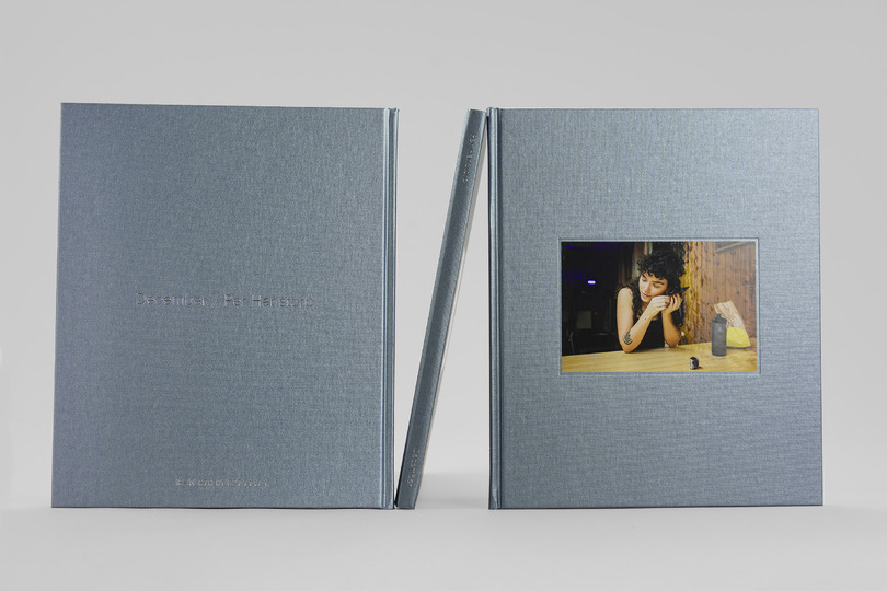
December – Per Hanstorp
A Walk in the Park and in Venice
Unwrapping Yrjö Edelmann
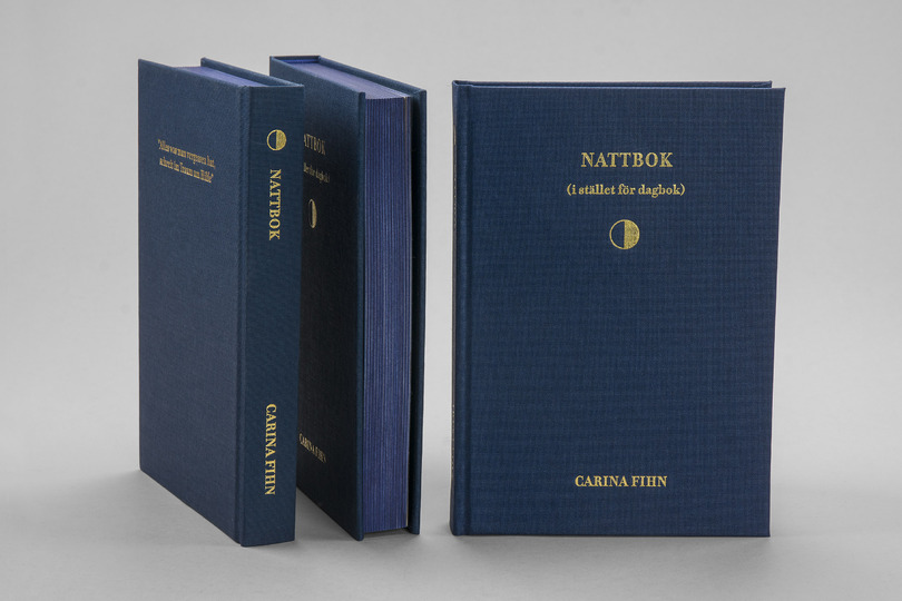
Nattbok istället för dagbok
Utställningskatalog – Korakrit Arunanondchai
Baka gott utan gluten
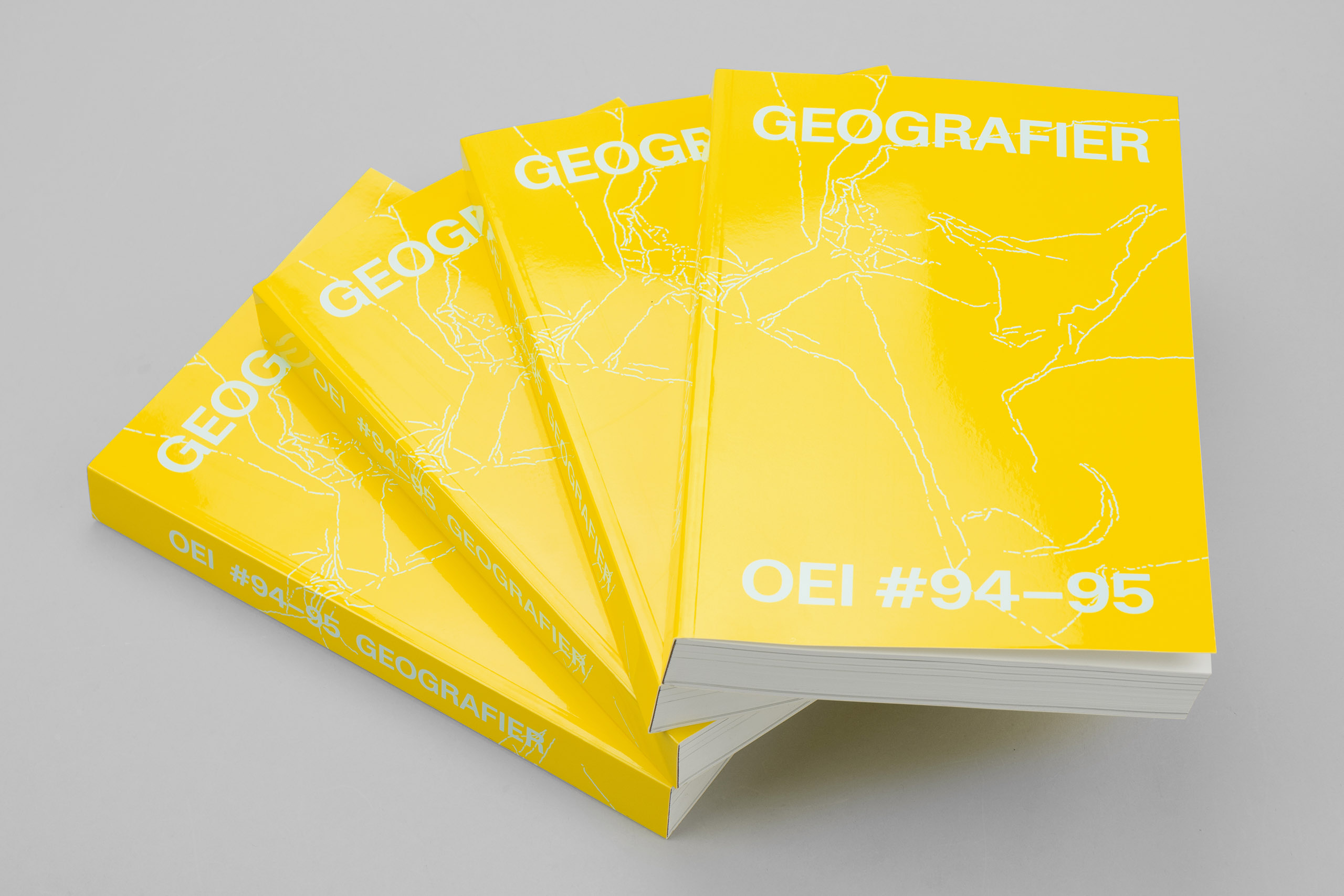
OEI #94-95
Inspirationskatalog 2022